
The critical thing that people don't get about the role of visual analytics in data analysis, in my opinion, is the role of storytelling.
When you mention “visuals” and “data”, a lot of people think “dashboards”, which is wrong. A dashboard, by its nature, is meant to give you readouts onto things you're supposed to already know.
So, for instance, the dashboard on your car: your speedometer is not about to start reading out in fractions of the speed of light (unless your car is a starship). Similarly, the odometer isn't supposed to signify anything besides how far you've driven (and, occasionally, whenever a cool number comes up) and it never goes backwards, unless something is badly wrong with your car.
A dashboard is not supposed to surprise you by showing you something you didn't expect; there's a fairly strict limit on the kinds of outputs that it gives you, actually. That's not a visual-analytical tool, properly speaking.
Instead, it's like finding a different way of looking at things that yields patterns you didn't see before.
So, for example, if you made a map of all the times that people got sick, and you realized that there were more people who got sick around wells, you might reasonably conclude, huh, maybe something in the water is making people sick. This is actually a true story from the very early days of cholera.

At its basic level, it's something we tell debate kids, which lawyers also say, which is, "tell a story".
The smart-ass answer that I gave, at least, when I heard this advice, was:
"Fine. Well, once upon a time there was Case, and Case solved and had a bunch of Advantages, and it outweighed the Disads which were non-unique anyhow, the end - oh and by the way, Case was totally topical."
This is, at some level (actually, a lot of levels) missing the point.
Besides the smart-ass answer, sometimes, somewhat more irritatingly, people repeat it like some liberal-arts buzzword incantation that spices up their basic-B Excel graphs without understanding what the concept means or trying to execute on it.
Thus, telling a story doesn't mean - in a more approachable example - showing a graph of "how many Ukrainians are separatists", and then stating:
"Once upon a time there was a bunch of separatist militant randos in Ukraine who decided that doing some separatist militant stuff was beneficial to them somehow, the end."
This is singularly unhelpful.
By "tell a story", we mean something more like "package that into a coherent narrative as compactly as possible by illustrating the core dynamic and evoking the missing details". I mean it in the sense of conveying an overall sense of the raw data; describing what's going on in terms of not just static numbers at one point in history.
So, it is somewhat unhelpful to say:
"hey, look, about 43% of Americans approved of Trump at his high-water mark"
Like, everyone knew that. This is trivial. Instead, framing it as a problem of adequately describing patterns, ebbs and flows, movements and limits - a process unfolding, not a static picture you're painting somebody - renders it into a reading that is, by its nature, non-trivial:
"The funny thing about Trump is that he never commanded above a 43% approval rating and his hardcore base of about 20-25% still hasn't deserted him, which says something about what kind of psychological itch they're scratching by being Trumpists."
Or, similarly:
"Disinformation narratives in the separatist community and the intensity of their propagation over the past year start to make sense when put in context of the Ukraine war"
The difference is between making sense of things by keeping track of what you're given, and just clock-punching and being a pass-through, a tool; or between just saying "I love data!" and actually producing finished intelligence incorporating data analysis as evidence.
In the original debate example, it'd be something like:
"Logic dictates you vote for us if you buy Harms and Significance, wherein we set out a weighing mechanism that precludes even looking at Disads off-case, and that section is relatively undisputed; your decision then flows from whether or not we adequately solve for the highest-priority impacts in the round that we present, and the answer there in the details is...", etc., etc.
It's like the difference between differential equations and calculus versus mere algebra; or the difference between doing a science experiment by just going through the motions, and actually conducting the experiment and treating even the null hypothesis, or the expected result, as something that you arrive at and examine objectively.
Lack of a pattern is sometimes more interesting than presence of pattern. For instance, the disjunction between rates of progress and tactics employed by the four separate fronts of the Ukraine war, which let American intelligence corroborate the inference, gained from intercepted radio communications - astonishingly, transmitted in the clear, on unsecured channels in the middle of a war - that there wasn't an overall commander for the war.
You need to go through the steps and "experience" the finding as it comes in order to credibly arrive at a reading like that.
The process is about fitting things into a pattern and making that pattern unambiguous and simple, and at some level, it requires homework. That's what the advice about storytelling really means.
For example, in 2017, looking at Howard, Kollanyi, et al., “Social Media, News and Political Information during the US Election: Was Polarizing Content Concentrated in Swing States?”, COMPROP DATA MEMO 2017.8, September 28 2017, Oxford Centre of Computational Propaganda (pdf), you might reasonably think:
“huh that’s sort of interesting that there’s six states that seem to have experienced the highest amount of disinformation retweets relative to its size”.
Look for some kind of correlation - any correlation, across time especially - tying together those states, especially one that someone like Paul Manafort might give Konstatin Kilimnik that falls within the kinds of things that a relatively savvy political consultant might employ, and you get something like this:

That teaches you a few things; perhaps the most concise way to put it might be something like:
The strategic usage of disinformation seems to be influence towards “unique” voter turnout that wouldn’t have occurred otherwise
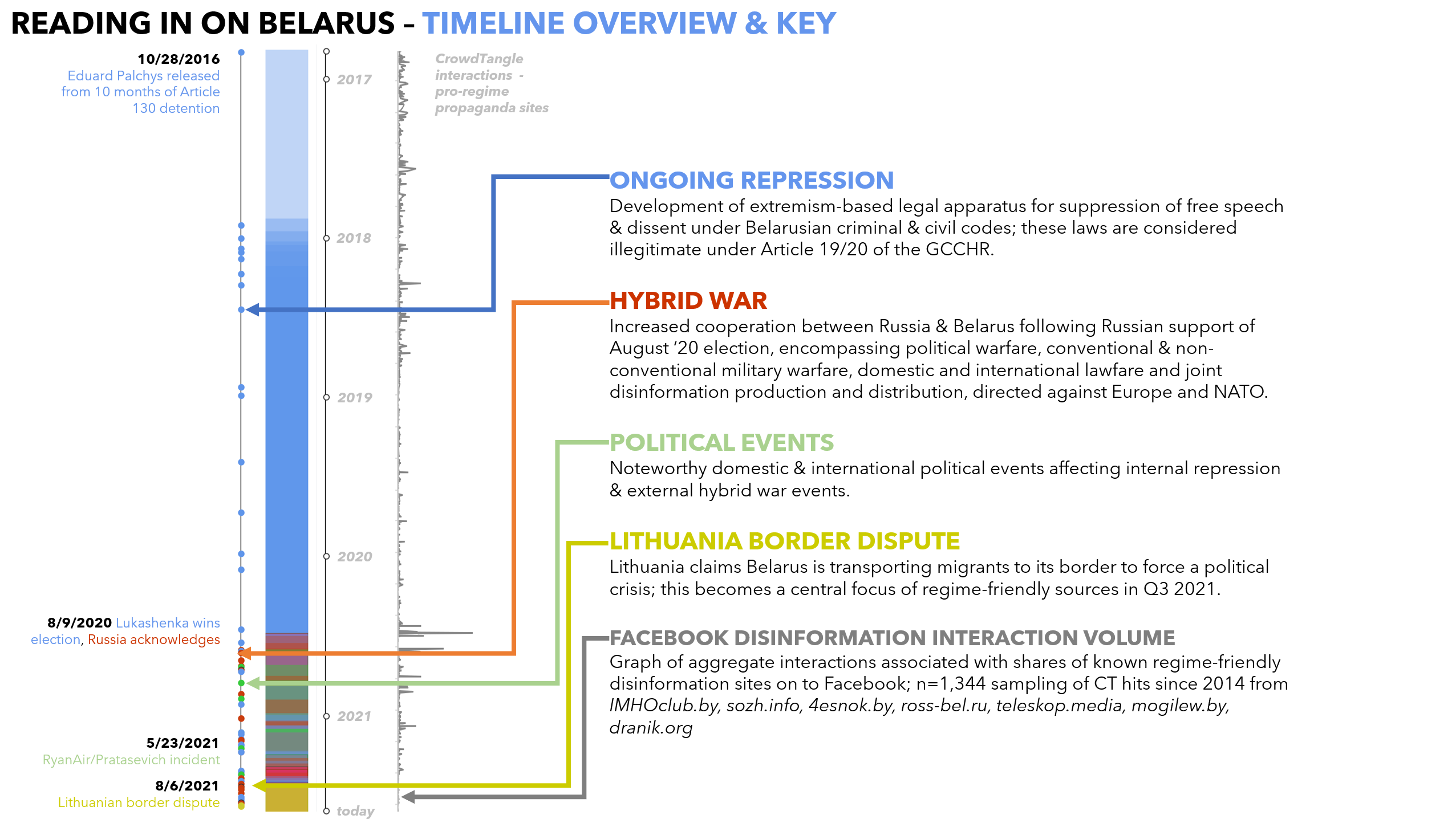
Or, consider what happens when you take every English-language news article you can find about noteworthy events in Belarus for four years:
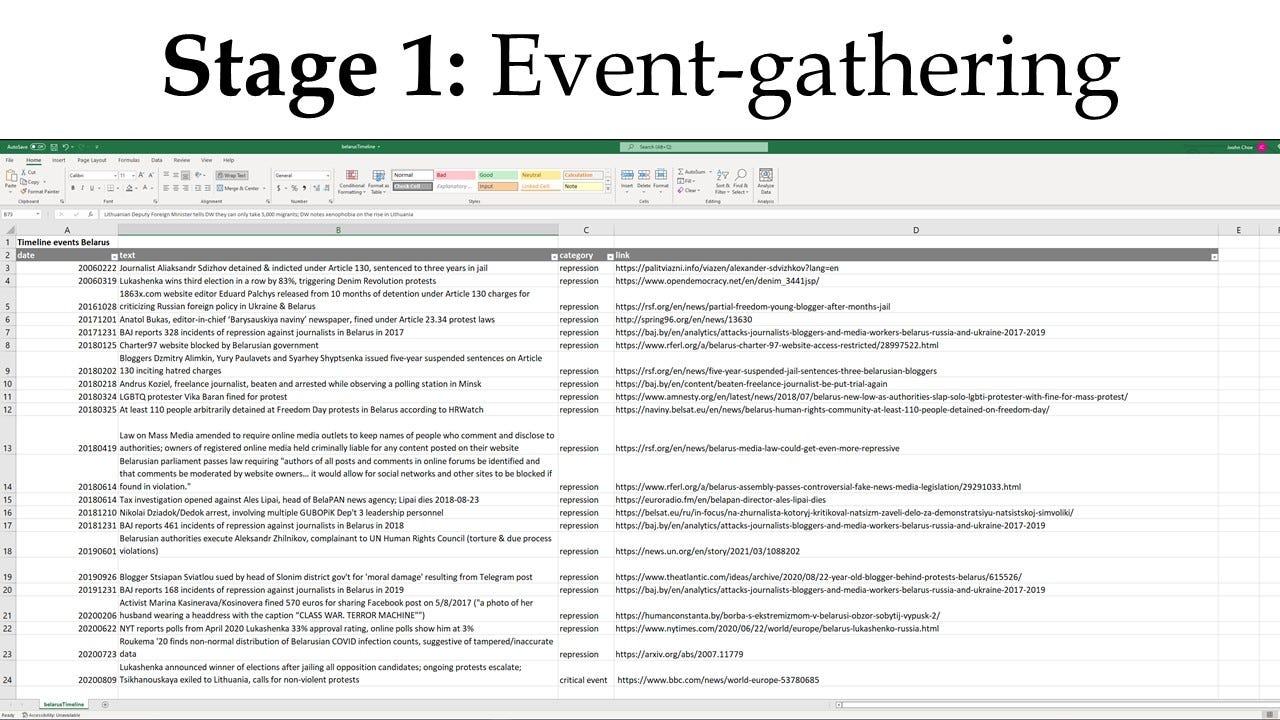
then lay them out in a timeline, and then color-code them - say, blue for repression and arbitrary arrests, red for hybrid-war events, yellow for an emergent geopolitical event, etc.
Then you might arrive at - completely by surprise - a reading of increasing density of events in an unexpected timeframe, like a somewhat inexplicable increase in reports of high-profile arrests, military deployment activity and geopolitical provocation in the last months of 2021, better than a year after a falsified election.
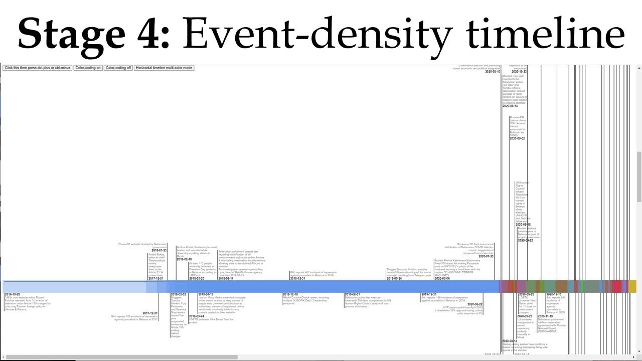
Lay that out alongside a gray graph of volume of interactions with disinformation sites, and then something like a pattern, alongside the absence of an expected pattern, starts to develop an even deeper story to tell:
At the philosophical level, borrowing from Situationist theory, the difference is between a close-ended process of work with a determinate result, and an open-ended process of play and discovery leading to definitional surprisal. We are engaged in a dérive, or a process of drifting through different “psychogeographical” ambiences, with no fixed destination or end point beyond “wherever I stop” and “whenever I have learned the feel of this place sufficiently “.
The only additional difference with visual analytics, as opposed to more traditional forms of data-based storytelling, is that when you produce visual-analytical products, you're telling a story you don't know the ending of, or a fable you don't know the moral of yet.
You're conducting an experiment, at the most basic level, and using the results to discover the shape of an idea.